05 / Case study / 2026
FLOW Snow
A snowboard identity built around freedom, balance, control and the rhythm of the mountain.
Overview
FLOW is a brand concept for snowboarders who want technical performance without losing the natural feeling of movement. The work connects naming, positioning, audience definition, competitive research and a flexible monochrome identity designed to live on boards, apparel, helmets and packaging.
01 / Positioning
A short name captures the experience of riding in rhythm.
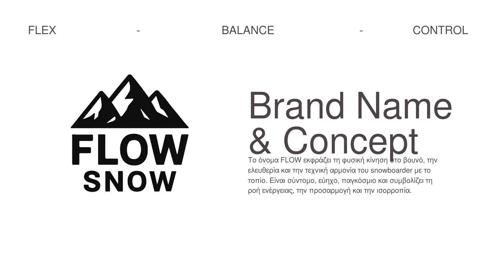
The name FLOW describes natural movement on the mountain: freedom, technical harmony, adaptation and balance. It is short, international and easy to connect with the feeling of a board responding intuitively to the rider.
The brand promise is simple: the board follows the rider instead of fighting them. The product story supports that promise through rider-centred curves, vibration control and a proposed carbon-and-bamboo construction.
02 / Market frame
Technical clarity creates space between mass-market and art-led brands.
A comparative review of Burton, Capita, Jones and GNU helped define a more focused position. FLOW is intentionally niche, minimal and technically expressed, with the experience of movement as its central difference.
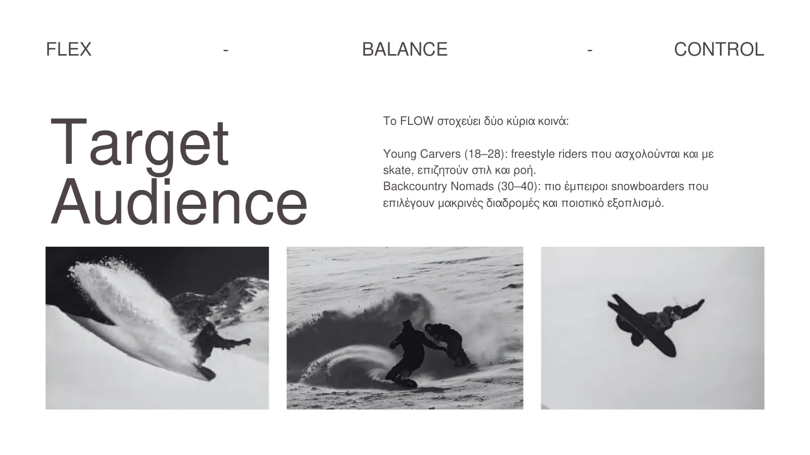
Two audiences anchor the direction: younger freestyle riders looking for style and fluidity, and experienced backcountry riders choosing higher-quality equipment for longer routes.
03 / Brand story
The landscape is treated as part of the product experience.
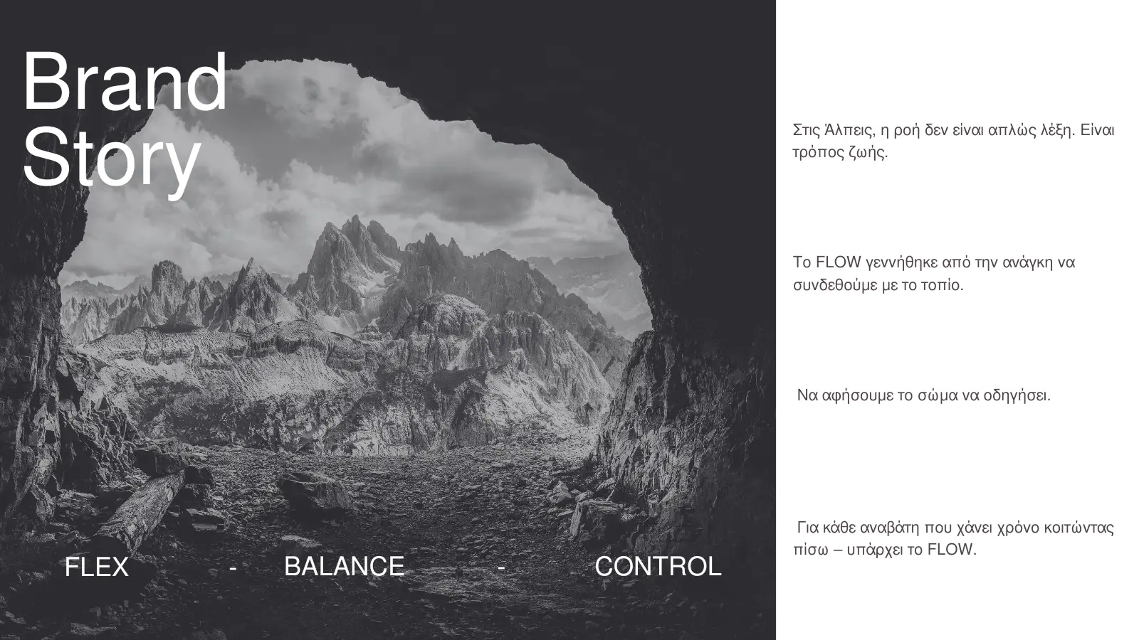
The narrative begins in the Alps, where flow is framed as a way of moving through terrain rather than a decorative slogan. The copy invites the rider to trust their body and connect with the mountain.
This gives the brand an emotional layer while keeping the tone clean, authentic and performance-oriented.
04 / Visual identity
Three peaks create a compact mark with a clear alpine origin.
The logo combines a three-peak symbol with a strong sans-serif wordmark. Black communicates technical confidence, white keeps the system clean and ice blue connects the identity to cold altitude and the outdoor environment.
The identity can operate as a full lock-up or as a standalone mountain symbol across smaller product touchpoints.
05 / Applications
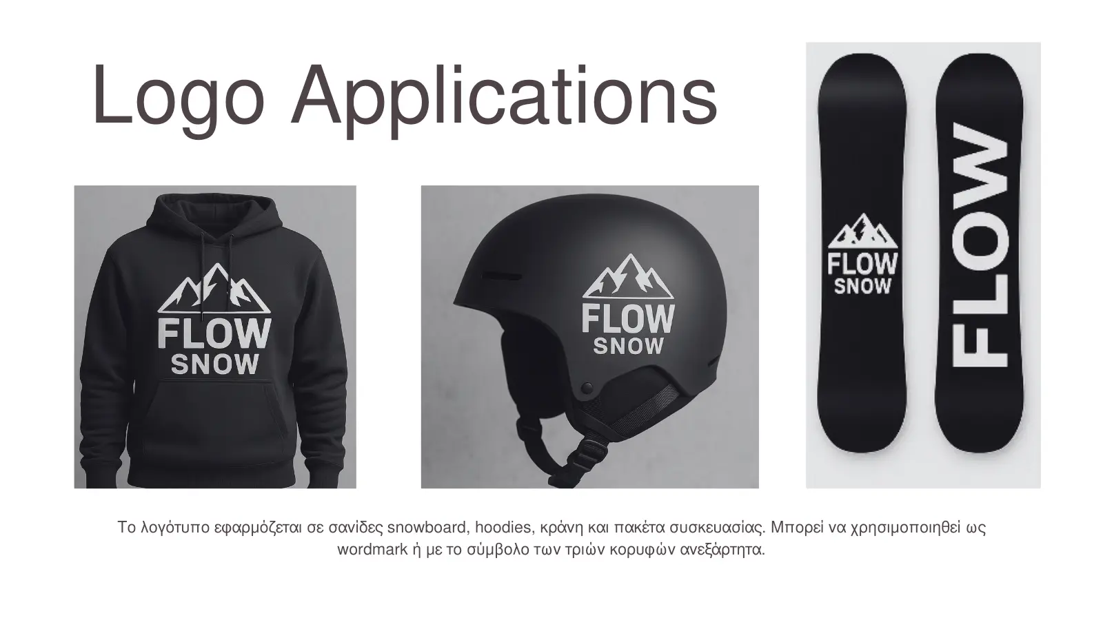
A restrained system lets the identity work directly on the equipment.
The mark was tested across snowboard graphics, hoodies, helmets and packaging. High contrast keeps it recognisable from a distance and makes the identity adaptable without adding unnecessary visual noise.
The result is a brand system that feels equally at home in product graphics, retail presentation and mountain photography.
Project details
From thinking to a tangible outcome.
Next case study